Financial Dashboards: Have they fulfilled their promise?
René Lebel
Vice President, Operations
Now that new corporate performance management practices are being taught at business schools around the world, various types of financial and operational dashboards, using different methods (technological or otherwise), have become increasingly widespread. They have tried to quench managers’ thirst for information in order to support their decision-making and thereby increase their organization’s performance. Has that objective been achieved, or are we still at the point of standing at the spring, but lacking the tools to draw the water?
Today’s more experienced managers no longer want their dashboards to present a static overview of the organization. Instead, they seek out solutions and tools enabling them to navigate through corporate information in an ad-hoc and user-friendly manner.
Assuming that managers will focus first on problematic situations and less on those that appear somewhat normal, it is vital that financial dashboards quickly inform managers where they should focus their attention.
A dashboard indicator that highlights underperforming items is more likely to attract attention. It should even be possible for managers to drill down to further levels of detail so they can pinpoint the exact source of the problem or know what to ask in order to make the necessary adjustments.
Thus, enabling different types of users to analyze information from different angles and perspectives and thereby discover the trends, rules and models behind that information is no longer an added-value, but rather a necessary, basic feature.
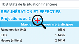
Take expense tracking. If the dashboard shows this indicator from only one perspective then its value is questionable. However, suppose these indicators are identified with a red, yellow or green light, based on the Actual vs. Budget operating cost statement for all the responsibility centres. This enables managers to easily identify activities, accounting items, types of expenses, and even the responsibility centres with cost overruns.
There are so many dimensions that it is impossible to foresee and structure them beforehand. The information must be organized and presented in a solution that users can tap into independently and find the items required.
In recent years, Business Intelligence software solutions have shifted their approach to a self-service one where users can access organizational information without compromising data governance. Innovative solutions have emerged, shaking up the somewhat conservative mentality of traditional suppliers in this industry.
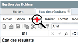
Some innovative suppliers have designed their user interface and functionality along the lines of such well-known and familiar tools as Microsoft Excel spreadsheets, providing a well-built platform that is well-suited to automated distribution of certain deliverables, such as dashboards, reports, and so on. Because the offer is available online, installation on the user’s workstation or tablet is not required.
It is therefore essential that users have access to data presentation products that are user-friendly and attractive.
The finance team is extremely receptive to this type of solutions, because they enable it to respond quickly to growing demands for management information from other areas of the organization.
The fact that some of these solutions, by providing data centralization and governance, are strikingly similar to the well-known Excel spreadsheets (without actually being them) means they are usually quickly adopted because they are easy to learn.
Some manufacturers of corporate performance management solutions, such as DECIMAL, have continued to work on integrating decision-making features into their budgeting and costing solutions, thereby greatly increasing their functional coverage and improving the usability and accessibility of information.
The outlook is very promising, especially in an industry that changes rapidly. One day soon, these new approaches will be able to quench our ever-growing thirst for information.
DECIMAL BI brochure


